密度图是数值变量分布的表示。比较
2 个变量的分布是一个常见的挑战,可以使用镜像密度图来解决:2 个密度图面对面放置,可以有效地比较它们。这是使用ggplot2库构建它的方法。
geom_density由于ggplot2的 geom 构建了密度图(参见基本示例)。通过指定可以倒置绘制此密度y = -..density..。建议使用geom_label来表示变量名。
1
2
3
4
5
6
7
8
9
10
11
12
13
14
15
16
17
18
19
20
21
22
| # Libraries
library(ggplot2)
library(hrbrthemes)
# Dummy data
data <- data.frame(
var1 = rnorm(1000),
var2 = rnorm(1000, mean=2)
)
# Chart
p <- ggplot(data, aes(x=x) ) +
# Top
geom_density( aes(x = var1, y = ..density..), fill="#69b3a2" ) +
geom_label( aes(x=4.5, y=0.25, label="variable1"), color="#69b3a2") +
# Bottom
geom_density( aes(x = var2, y = -..density..), fill= "#404080") +
geom_label( aes(x=4.5, y=-0.25, label="variable2"), color="#404080") +
theme_ipsum() +
xlab("value of x")
#p
|
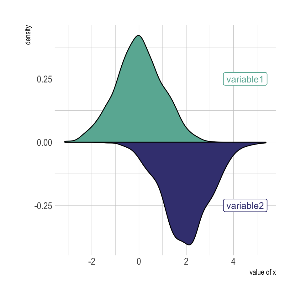
图1
直方图geom_histogram
当然,可以使用完全相同的技术来geom_histogram代替geom_density获得镜像直方图:
1
2
3
4
5
6
7
8
9
10
| # Chart
p <- ggplot(data, aes(x=x) ) +
geom_histogram( aes(x = var1, y = ..density..), fill="#69b3a2" ) +
geom_label( aes(x=4.5, y=0.25, label="variable1"), color="#69b3a2") +
geom_histogram( aes(x = var2, y = -..density..), fill= "#404080") +
geom_label( aes(x=4.5, y=-0.25, label="variable2"), color="#404080") +
theme_ipsum() +
xlab("value of x")
#p
|
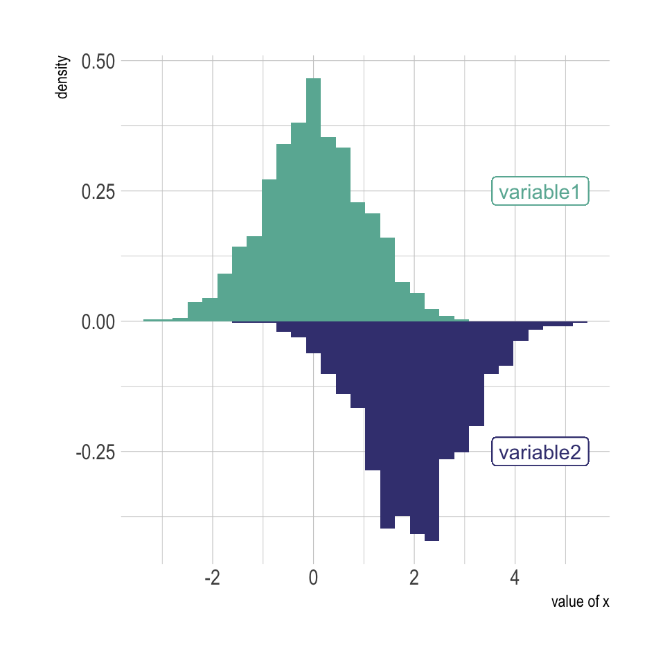
效果图
摘自:https://r-graph-gallery.com/density_mirror_ggplot2.html